
Welcome aboard
A revamp of our onboarding experience to make it smooth, hassle-free, and enjoyable from start to finish. Say goodbye to frustration and hello to a delightful journey with us.


Problem Statement
As a prominent energy company, we recognise the importance of staying competitive. However, our onboarding dashboard fell short compared to rival companies, lacking essential information upfront, crucial to our customers. Given the competition in the industry, it was crucial to revamp the visual aspect of the dashboard.
Solution
Create a delightful and seamless onboarding experience, making the information clearer and more discoverable, leading to increased Customer Satisfaction Rates and establishing trust right from the beginning of our customers' journey with us.
Outcome
An increase in customer satisfaction by over 60%, along with a decrease of over 70% of customers saying they didn’t find the information they expected to see.
User pain points
Scrolling up and down searching for information.
Feel information is hidden, which can lead to trust being broken.
Unable to access vital information about their switch status, payments, tariffs, and account numbers quickly, easily and in an accessible way.
Feeling like just another customer.
Design Process
Primary Research
Through Get Feedback, we received organic feedback that shed light on our CSAT rating, which stood disappointingly low at 2.3%. Armed with this valuable insight, I decided to delve deeper by utilising FullStory to observe how customers interacted with our page.
What I found was eye-opening. Many customers were seen scrolling up and down, seemingly struggling to find the tab with crucial details about their switch. This led them to another page, where they could access vital information about payments, tariffs, and account numbers. However, this page also contained information that required customers' verification, possibly causing delays in their switch if anything was amiss.
Taking these invaluable observations, I knew we had to make a change and improve our customers' experience. I presented my findings to the team, and based on my hypothesis, it became evident that customers craved a more personalised and convenient solution of having all the essential information on one page.
“Stop hiding the information I want to see!”
First Iteration
Despite facing another ongoing project, which was a regulatory requirement, I didn't let that deter me from making a difference. In the interim, I swiftly devised a plan, facilitating a critic and requirements session, and presenting my designs to stakeholders that transformed the current tab into a captivating Call-to-action button. With a concise yet informative paragraph, we enhanced its prominence, ensuring customers could effortlessly access the information they needed.
I collaborated with engineers to deliver the first iteration of the new onboarding dashboard.
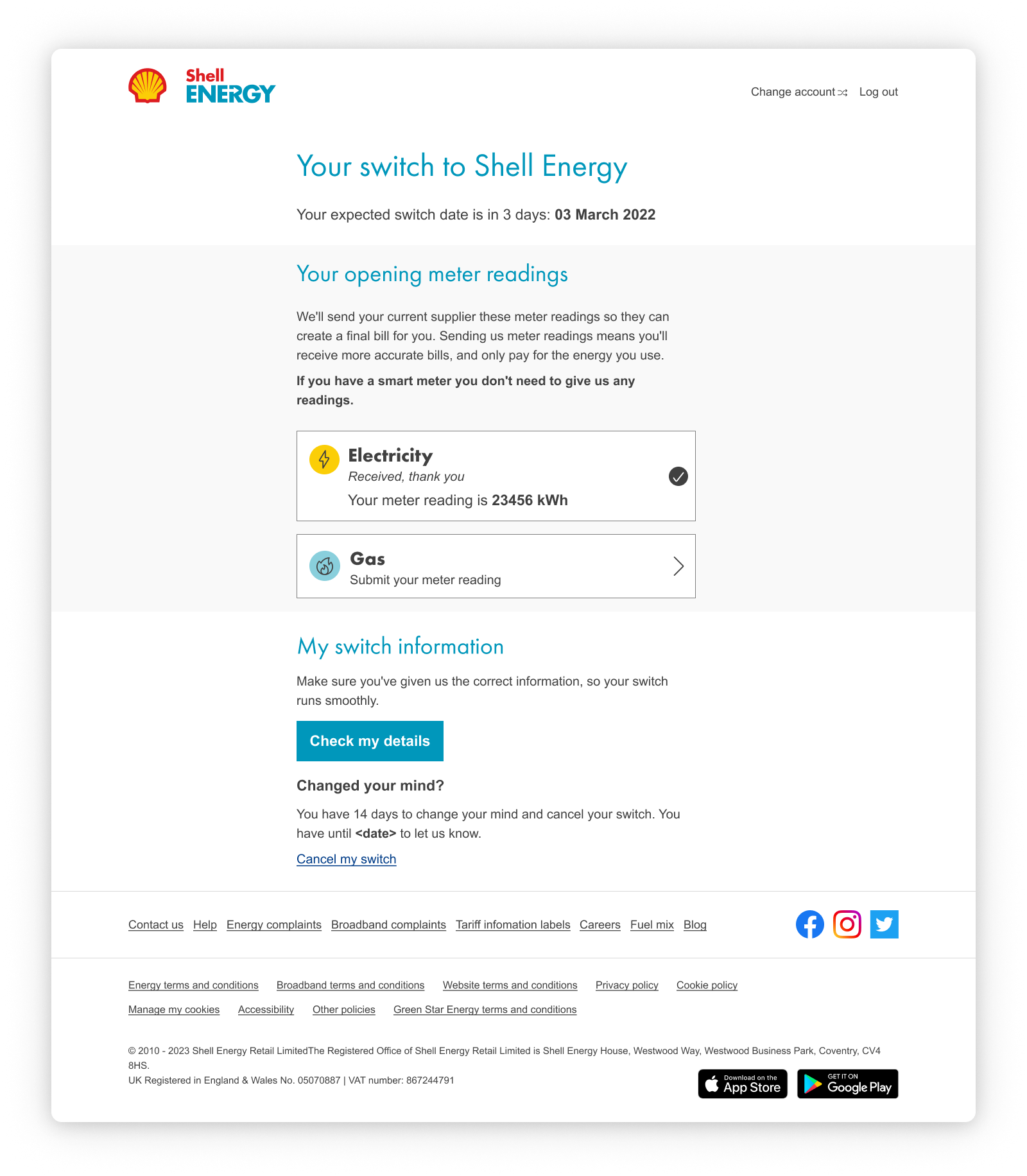
Simplify the information regarding the switch dates, removing the yellow pill, as customers expected this to be interactive and caused rage clicks.
Provided a real-time countdown of the customer switch date, to provide a more personalised experience
Used more customer-centric wording for the heading, and a small paragraph, to provide information, to draw our customer’s attention to what was behind the button and actions the customer may need to take.
Used simple, customer-centric language on the button text to aid our customers in navigating the page and informing users what will happen when clicking the button.
Moved the cancel switch information to create a more fluid flow to the page, and have as a secondary action to submitting their opening read and checking vital information.
Following our design guidelines and design system, allowed me to focus on the layout of the UI, along with applying design principles and best practices.
The thought process behind the visual design was to:
Feedback
With the implementation of our first change, we witnessed a significant leap in customer satisfaction. Our CSAT rating soared from 2.3% to an impressive 3.6%!
Actively seeking feedback from our customers, I wanted to know exactly how they felt about the changes made. While we celebrated our success, I also acknowledged that 36% of customers indicated that the page still didn't meet their expectations.
Second iteration
Continuing the momentum of improvements was crucial given the valuable feedback I gathered. To achieve this, I embarked on the task of creating several design concepts. The ultimate decision on which version to implement was based on design reviews with the UX team, adhering to design guidelines and best practices.
To ensure I had everyone's input and buy-in, I organised a productive critic workshop with key stakeholders. In this workshop, I presented the designs and thoroughly discussed their technical feasibility. This collaborative approach ensured that we not only had a top-notch design, but also a solution that was practical and achievable.
Following our design guidelines and design system, allowed me to focus on the layout of the UI, along with applying design principles and best practices.
The thought process behind the visual design was to:
Add personalisation by using our customer's name and providing a welcome message, letting customers know what is happening and making a memorable interaction.
Emphasis on the important information customers wanted to know by using different type weights, especially with bringing more information onto one page.
Lines to divide content, reducing cognitive load and helping understand which content was grouped.
Placing information within a container helps bring space and focus to critical information and actions that customers may need to take.
Implementing a tooltip, to let customers know what an estimated switch date meant, without adding further text on the page.
Feedback loop
Following the implementation of the second iteration changes, I launched a clean survey along with the new dashboard page, seeking feedback on the same aspects.
The results were astounding! In the first six weeks after the release, our CSAT skyrocketed to an impressive 4.6%. Even more remarkable, only 8% of customers responded negatively, stating that the page didn't meet their expectations in terms of information.
These statistics validate the effectiveness of our efforts. By actively listening to our customers and making thoughtful improvements based off of my suggested improvements, we achieved a level of satisfaction that's truly remarkable.
Key Learnings
Looking back at this incredible project, I couldn't be more thrilled with the decision to take a two-fold approach to the dashboard.
While my eagerness tempted me to jump straight into doing a full overhaul in one go, I now realise the wisdom behind this approach. It opened the doors to invaluable insights and feedback from our customers, confirming my hypothesis about their desires and expectations for this page.
The journey of continuous improvement has been both rewarding and enlightening. By embracing this iterative process, we've ensured that every step we took was guided by real customer needs.
This project has truly reinforced my commitment to excellence and customer-centricity. As I move forward, I'll continue to listen, learn, and adapt, making sure to take this approach where necessary.