
The Bank Job
In the realm of continuous improvement, our focus was set on enhancing the payment journey for our energy customers. This case study unveils the challenges faced, the thoughtful solutions implemented, and the positive outcomes achieved through a structured design process.


Problem Statement
Customers encountered difficulties making payments due to interface and technical issues. One notable issue was the inability to self-authenticate, compounded by confusion related to accepted card types, with a significant number of customers attempting payments with Amex, which we did not support.
Solution
Addressing the identified challenges, a revamped payment journey with a more intuitive interface, introducing an enhanced structure. By strategically incorporating additional next steps, our goal was to guide customers effortlessly through the payment process.
Outcome
Post-implementation, we witnessed a substantial decrease in dead and rage clicks, along with reduced customer contact. Key metrics demonstrated the success of our approach.
Challenge
Navigating the challenge of customers encountering difficulties in making payments without discouraging their intent to pay was a delicate balance.
Recognising the importance of fostering a self-serve journey, my approach focused on providing support and guidance. It was clear that I needed to: empower these customers to overcome hurdles seamlessly.
By enhancing the user interface and strategically integrating additional guidance steps, I aimed to not only resolve the existing issues but also ensure that every customer felt supported and capable of completing their payment journey independently.
User pain points
Not having clear information about what card types are or aren’t accepted.
No help or guidance as to how I can pay, if card not accepted.
Having payment fail multiple times.
Inputting information to then be told it’s failed due to payment type used.
Already feeling negative emotions when having to pay for bills without, then having a frustrating experience.
Design Process
Alignment
In March 2023, I started to dig into our payment journey, with insights revealing that 6.8K customers struggled to make successful payments.
Sessions on Fullstory uncovered user confusion, especially around the 'Pay another amount' field. The analysis identified issues like self-authentication problems and the prevalence of Amex cards.
I also observed sessions on Fullstory, Dead, and rage clicks the ‘Pay another amount’ field which was visible but disabled until the radio button had been selected, this confused our customers.
Ideation
A previous improvement saw the implementation of static images of the card-type logos we accept, this helped to see a reduction of Amex card payments from 17.5% to 4.51%, however, this was not enough.
Based on my observations of user behavior from Fullstory, customers were seen clicking these images thinking they were interactive.
The first step was to discuss with our third party, payment provider on using card validation within the card number field, the outcome was the third party taking this away, and advising it may take months to start the work. Based on this I wanted to look into what could be done by us before this.
After doing some competitor analysis, I created some new designs to improve the journey, one new implementation was using radio buttons to aid with customers who may be using a card type we don’t accept. Another addition was adding an option for those customers wanting to use another card type, to still be able to make a payment
Playback and implementation
A design playback session garnered positive feedback, leading to productive discussions for future improvements.
A subsequent refinement with the product owner and development team ensured alignment, understanding, and the reasoning behind the changes, before aligning on success metrics and technical aspects.
Adopted an iterative approach, releasing improvements in stages to expedite impact assessment.
Working with our third-party payment providers, at a later stage the card number input validation was implemented, ensuring customers who may have bypassed the card type selection and wanted to pay with an unsupported card, would
Feedback
After my suggested changes, there was a 65% decrease in Amex usage after the third iteration, meaning fewer failed payments were being processed.
Additionally, implementing the bank transfer option led to an 11.62% increase in this payment method, ensuring customers were still able to make a payment.
Also with further changes with the new ‘Another amount’ field, we saw just over a 50% reduction in Dead and Rage clicks on these fields and a decrease in contact of 60/per week, in turn helping to reduce business costs.
Designs
Following our design guidelines and design system allowed me to focus on the layout of the UI, along with applying design principles and best practices.
The thought process behind the visual design was to:
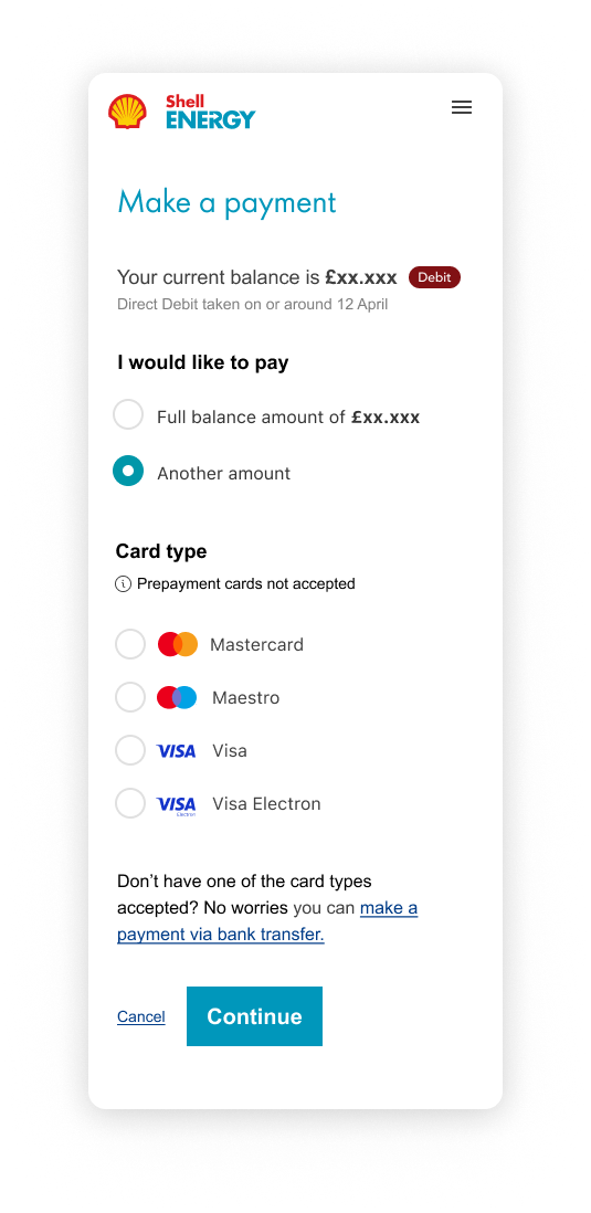
Add headings to each section, to create various levels of hierarchy helping users better navigate the page, also using more user-friendly wording such as ‘I would like to pay’.
Changed the type weight of the money values for the balance and payment amount to create emphasis making this important information a focal point, I also wanted to add prominence to the customer balance when in Debit or Credit, this was done by adding a coloured pill next to the balance, drawing attention to this important information for the customer.
Radio buttons were used for users to select their card types, creating an interaction with the elements, to draw attention to the card types accepted for the user, also providing visibility to all options making it easier for users to select.
The microcopy and bank transfer link were placed at the end, to ensure the page continued to flow, helping customers with an unaccepted card type.
Have the field become visible when the customer selects ‘Another amount’ option, reducing cognitive load, and allowing customers to focus on one interaction at a time.
Validation error behaviour, was changed to allow decimal points to be entered by customers within the input field, aiding accessibility.The back button is placed in the left corner of the Card details page, following best practices to help customers go back to make any changes to their payment.
Learnings
Reflecting back on this project, it’s great to see how making small iterative changes can really make a difference and how it can make it easier and more effective to measure success.
It can be easy to want all the changes to happen all at once, but this shows how incremental changes can also be great, and will take this on board for future projects.